
Know More
Having worked closely with Flawless's brand identity across multiple projects including creating the company's first-ever brand guideline. I identified that the company profile brochure no longer reflected the business's evolution into a more established, credible distributor. I proposed a full redesign, applying the same guideline I had developed to bring visual consistency to a document used to introduce the company to partners, retailers, and distributors.
Problem
Before this project, Flawless had no formal brand guideline visual identity varied across materials, making it harder to present a consistent, credible image to partners and distributors. Having built that foundation myself, I recognised the company profile brochure as the clearest opportunity to put it into practice: a document that needed to function both as a sales tool and an institutional business card, communicating hierarchy of information, credibility, and brand identity all within a single format.


Solution
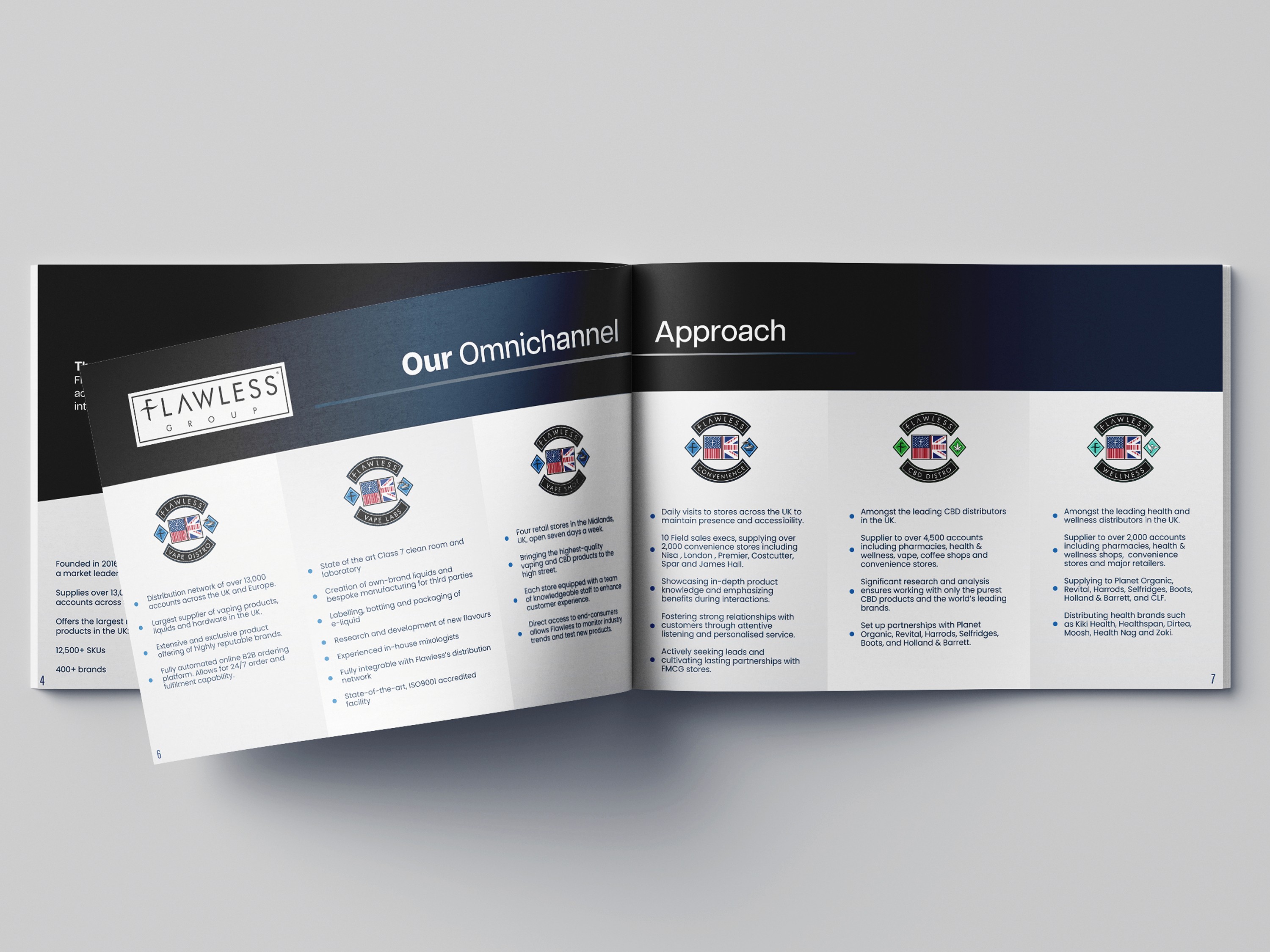
I designed the brochure around the visual system I had established for Flawless — a structured grid, confident typography, and a dedicated section illustrating the omnichannel approach, visually mapping how the business operates across multiple sales channels. The result is a document that communicates professionalism and scale, suited equally to in-person partner meetings and digital distribution to prospective distributors.

Concept
The brochure was built around a single idea: consistency as credibility. Every layout decision from the grid structure to the typography hierarchy was designed to reinforce the same visual language Flawless now applies across all its brand touchpoints, from retail displays to trade show stands. Rather than treating the brochure as a standalone piece, it was approached as proof of concept for the guideline itself: a demonstration of how a cohesive identity system holds up across formats, giving partners and distributors a clear, confident first impression of the business.

More Works
©2026


Know More
Having worked closely with Flawless's brand identity across multiple projects including creating the company's first-ever brand guideline. I identified that the company profile brochure no longer reflected the business's evolution into a more established, credible distributor. I proposed a full redesign, applying the same guideline I had developed to bring visual consistency to a document used to introduce the company to partners, retailers, and distributors.
Problem
Before this project, Flawless had no formal brand guideline visual identity varied across materials, making it harder to present a consistent, credible image to partners and distributors. Having built that foundation myself, I recognised the company profile brochure as the clearest opportunity to put it into practice: a document that needed to function both as a sales tool and an institutional business card, communicating hierarchy of information, credibility, and brand identity all within a single format.
Solution
I designed the brochure around the visual system I had established for Flawless — a structured grid, confident typography, and a dedicated section illustrating the omnichannel approach, visually mapping how the business operates across multiple sales channels. The result is a document that communicates professionalism and scale, suited equally to in-person partner meetings and digital distribution to prospective distributors.
Concept
The brochure was built around a single idea: consistency as credibility. Every layout decision from the grid structure to the typography hierarchy was designed to reinforce the same visual language Flawless now applies across all its brand touchpoints, from retail displays to trade show stands. Rather than treating the brochure as a standalone piece, it was approached as proof of concept for the guideline itself: a demonstration of how a cohesive identity system holds up across formats, giving partners and distributors a clear, confident first impression of the business.
More Works
©2026
Know More
Having worked closely with Flawless's brand identity across multiple projects including creating the company's first-ever brand guideline. I identified that the company profile brochure no longer reflected the business's evolution into a more established, credible distributor. I proposed a full redesign, applying the same guideline I had developed to bring visual consistency to a document used to introduce the company to partners, retailers, and distributors.
Problem
Before this project, Flawless had no formal brand guideline visual identity varied across materials, making it harder to present a consistent, credible image to partners and distributors. Having built that foundation myself, I recognised the company profile brochure as the clearest opportunity to put it into practice: a document that needed to function both as a sales tool and an institutional business card, communicating hierarchy of information, credibility, and brand identity all within a single format.
Solution
I designed the brochure around the visual system I had established for Flawless — a structured grid, confident typography, and a dedicated section illustrating the omnichannel approach, visually mapping how the business operates across multiple sales channels. The result is a document that communicates professionalism and scale, suited equally to in-person partner meetings and digital distribution to prospective distributors.
Concept
The brochure was built around a single idea: consistency as credibility. Every layout decision from the grid structure to the typography hierarchy was designed to reinforce the same visual language Flawless now applies across all its brand touchpoints, from retail displays to trade show stands. Rather than treating the brochure as a standalone piece, it was approached as proof of concept for the guideline itself: a demonstration of how a cohesive identity system holds up across formats, giving partners and distributors a clear, confident first impression of the business.
More Works
©2026